StageSource 2019 Census Analysis
Basic Overview
Status: Completed
Timeline: 2 Months November 2020-January 2021
Technology: Python, SQLite, R
Note: The full project includes personally identifying information so code has been modified and data omitted to obscure this.
Download Source CodeMethod
- Ingest data from two distinct but related surveys and pull them into a single database
- Write queries on the created database to draw insights on (1) respondent demographics and (2) income
- Generate visuals for respondent demographics
- Perform comparative analysis on income by various demographic measures
- Present findings to non-technical stakeholders and explain results
Data Ingestion
My first task was designing a permanent home for the data that was more organized than the default output from surveymonkey, the site used by StageSource to create the survey parts. I had a lot of different data to use, and this design needed a lot of updates as the messy data got cleaned and the needs of analysis became clear, but the foundation did not deviate from here.
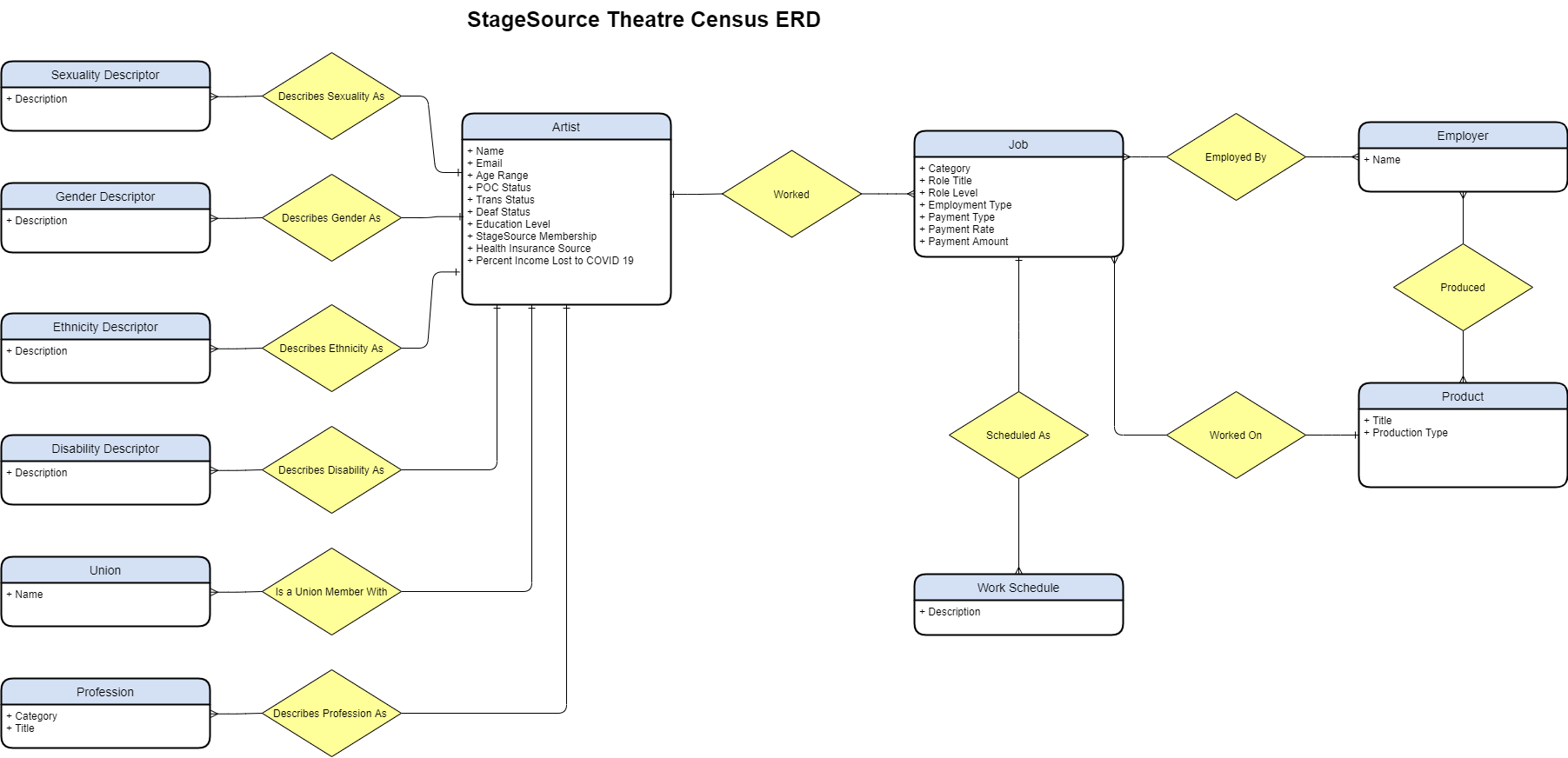
The design may seem odd to people who are familiar with conventions of storing demographic data, but per StageSource's survey design, respondents could have one or more self-descriptors for each and every demographic vector. While the numerous tables is not helpful for analysis, it does make it easier and more efficient for storing, adding new options, and updating the data should respondents wish to update their self descriptors later.
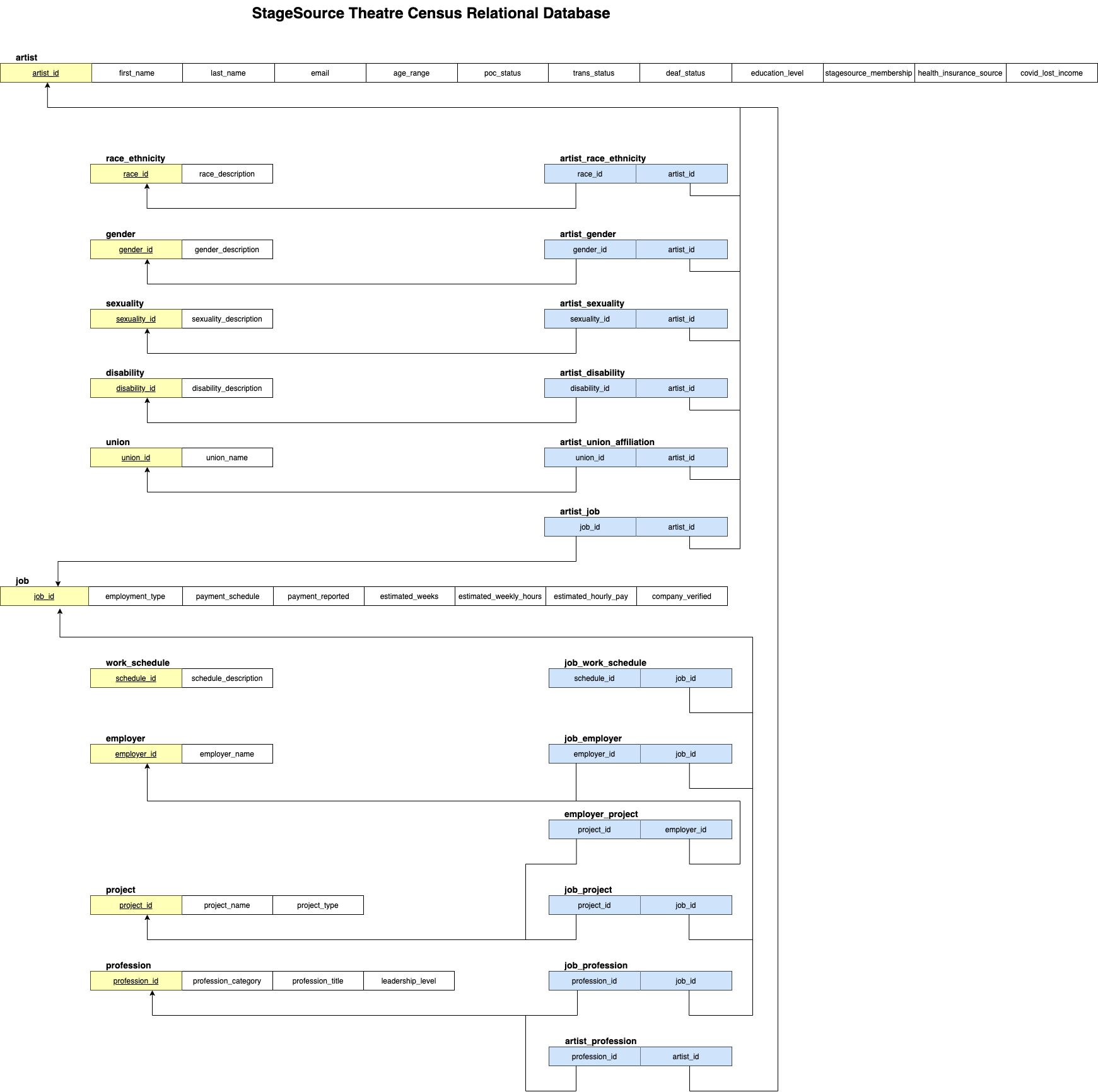
I refined this ERD diagram into a relational database scheme:
Demographic Overview Approach
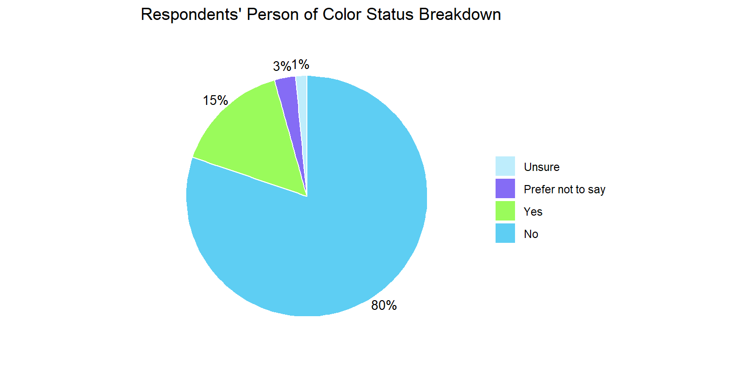
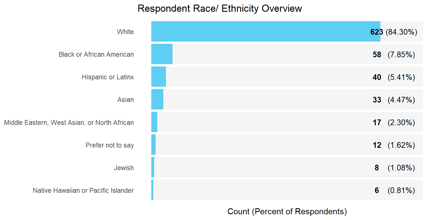
After writing the script to ingest the data into a SQLite database, I wrote two quiries to generate a demographic overview and an income overview. I wrote a basic R markdown script to slice the demographic data and generated the charts below using ggplot.
I knew these charts would go into a StageSource branded report (or, so I thought) so I did my best to match company branding. Ultimately the report did not reach the public for reasons which will be made more apparent after the income analysis.
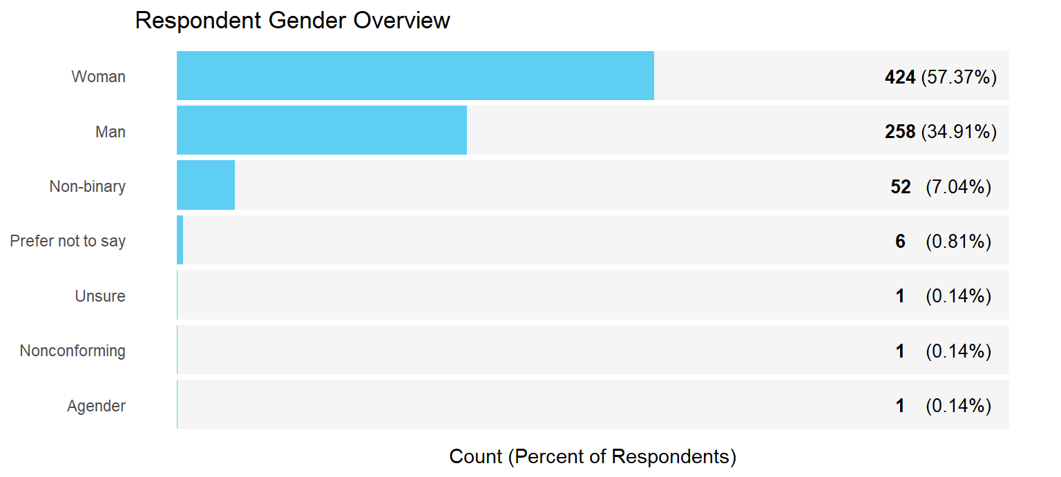
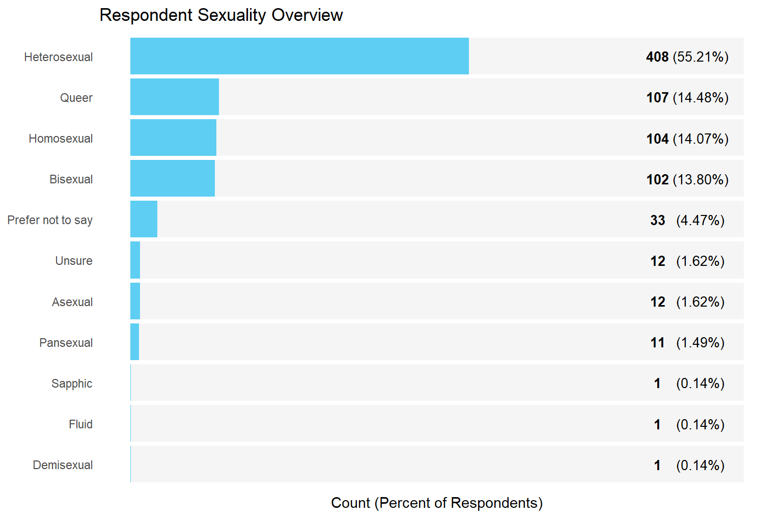
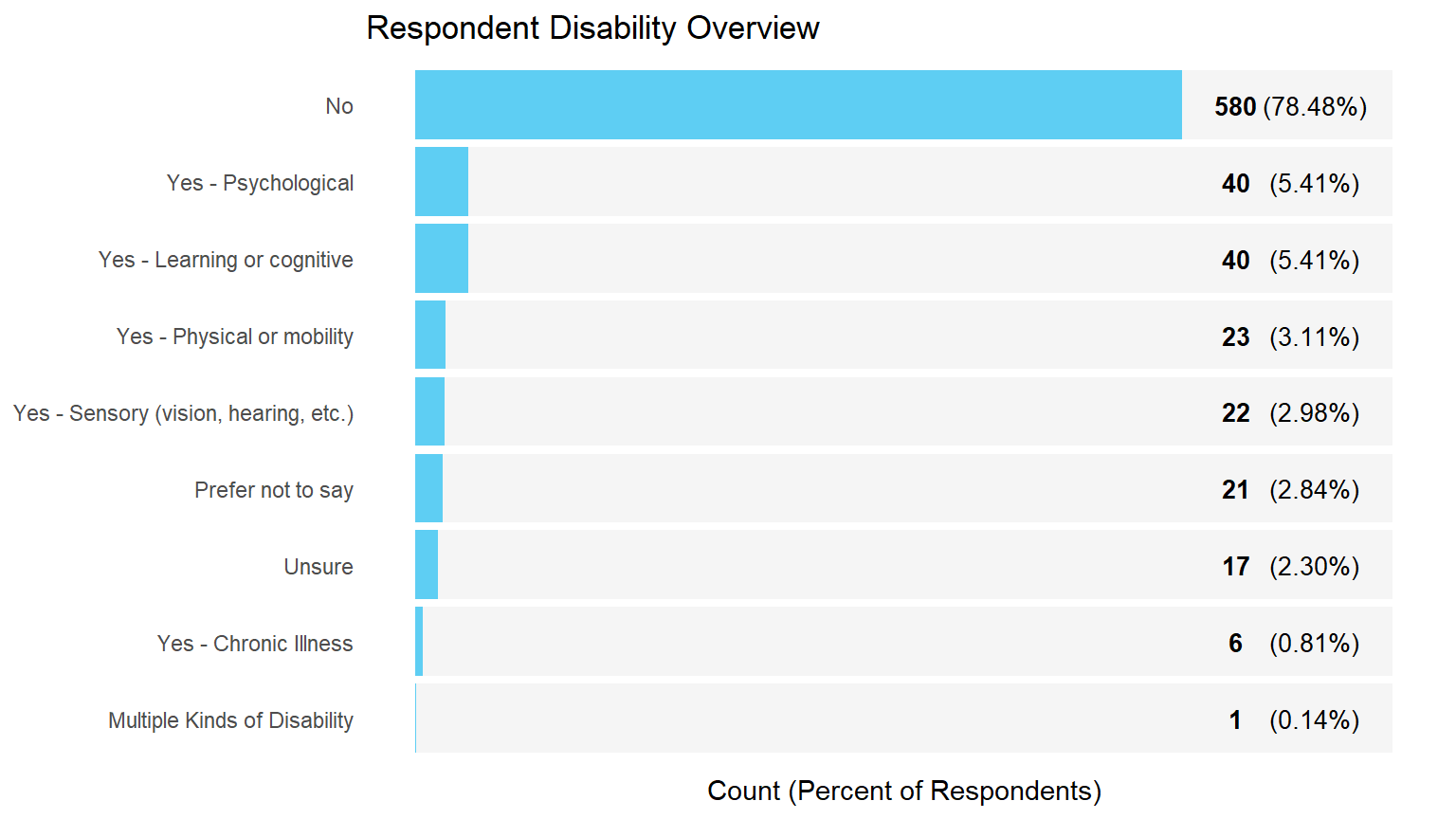
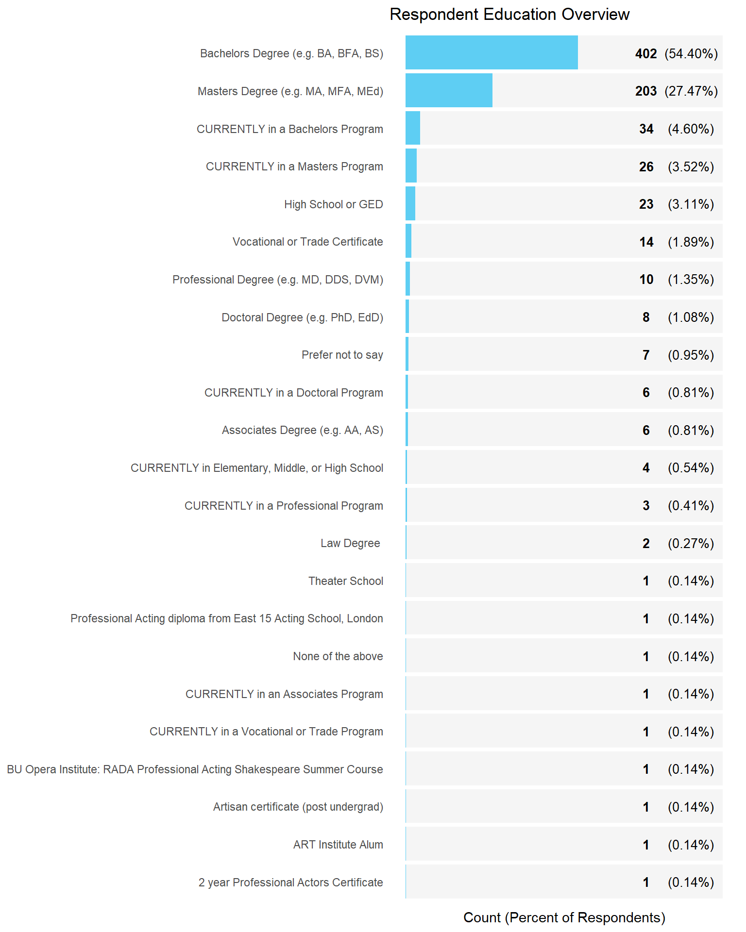
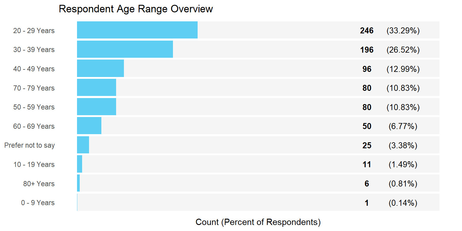
Demographic Overview Charts
Income Analysis Approach
There were a few big challenges for this portion of the project, most notably that survey respondents had been able to provide their income in several different ways, including with just an open fill in field. I worked with a couple interns at StageSource to manually go through the responses and sort them into various pay rate categories-- Hourly, Weekly, Annually, or Stipend.
At this point I was left with a problem though, as I had no way to unify these disparate data sets since I had no clue how to convert weekly into hourly since I had only been given a rate and amount, nothing to convert between rates in the replies. My solution was to assume that the standard deviation for all the different pay rates was just a unit-scale difference but was otherwise uniform (a HUGE assumption) and then normalize the data using the pay scale standard deviations.
With the normalized data I kept the sets separated and compared them by just reported income rate.
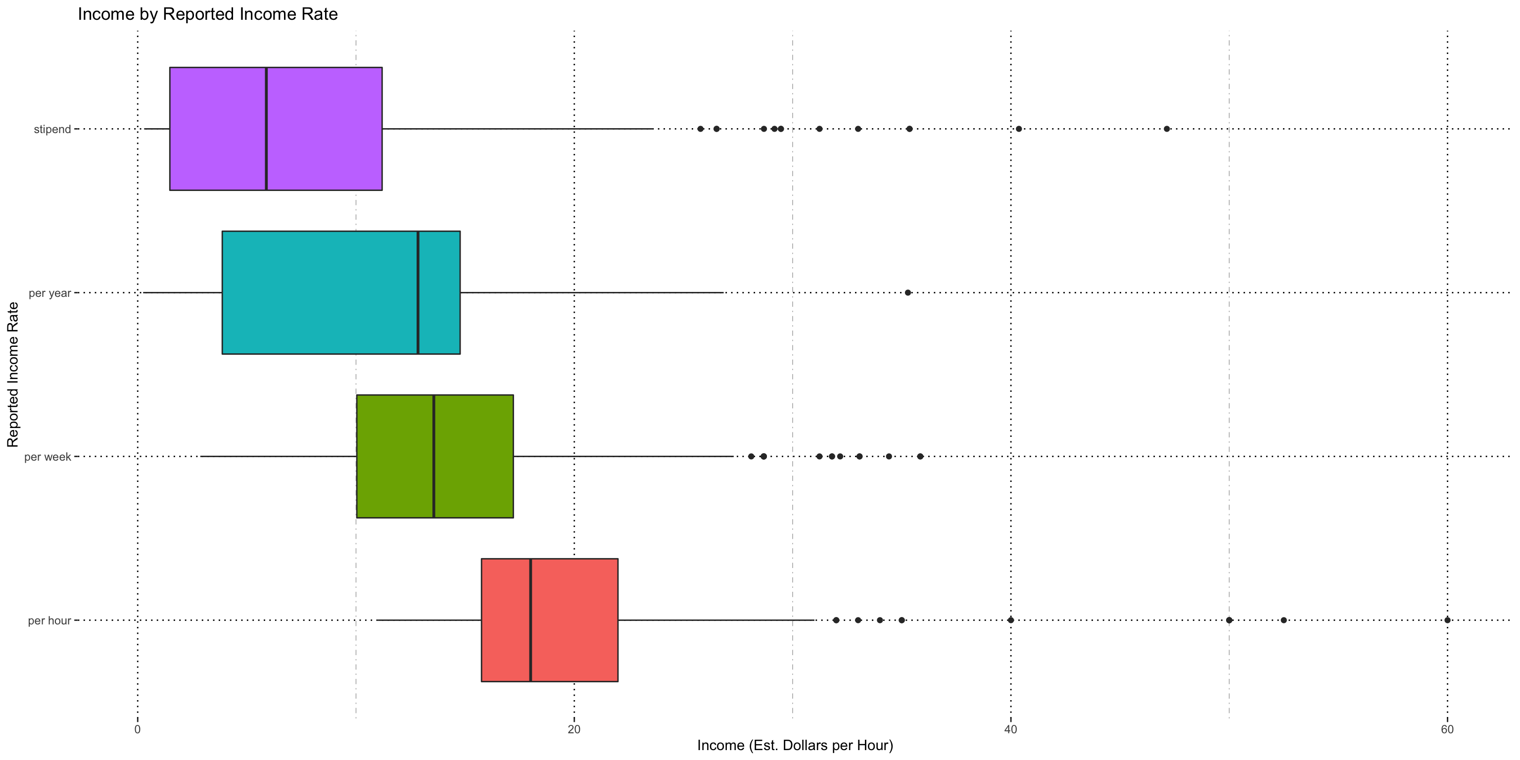
I used a pairwise Wilcoxon Rank-Sum test to determine if these new, normalized sets were independent from one another.
| Wilcoxon Rank Sum Results | ||
|---|---|---|
| Pay Rate 1 | Pay Rate 2 | P-Value |
| Per Hour | Per Week | 6.69E-12 |
| Per Hour | Per Year | 8.47E-13 |
| Per Hour | Stipend | 2.20E-16 |
| Per Week | Per Year | 0.0086 |
| Per Week | Stipend | 2.20E-16 |
| Per Year | Stipend | 0.006451 |
| alpha = 0.2 | ||
Reported income amount does vary by choice in reported scale, even after being normalized. The distributions imply that stipends get paid the least, followed by annual pay, followed by weekly, followed by hourly and this makes sense according to the industry experts I’ve consulted with, so I don’t have evidence that my assumption about the constant variance is wrong at least looking at how their distributions are ordered. They believe reported rate of pay may be related to job titles (we have ~150 distinct jobs in the data) so this will be explored in future analysis.
I chose to use a scaling factor of this normalized data for my analysis report, multiplying each normalized number by the sample standard deviation for the hourly data so it’s in a human-interpretable unit. I cannot say that the overall “average dollars per hour” using this scaled data is meaningful though, since it is a very imprecise scaling factor.
Income Analysis Results
Note: Some outliers have been left in because they are valid data points; removing them doesn’t make sense when talking through it with my industry expert. Keeping them in keeps variability high though. (Original data: ~1200 jobs, subset for this analysis is 736, removing some outliers and ambiguously scaled data).
Method
- Remove demographics with <20 data points to try and keep tests valid
- Two way ANOVA using a regression model looking at income as a function of reported pay scale and demographic (e.g., race)
- If interaction term is significant, split the data by pay scale
- Already know pay scale is significant, only concerned with interaction terms.
- One Way ANOVA looking at income as a function of demographic
- Tukey's HSD for pairwise comparisons (confidence interval = 0.95)
- Summarize results of Tukey's in a histogram with lettered categories
- Use histogram to verify assumptions for Tukey's
Race/ Ethnicity
I did not find a significant interaction term, so can compare full set.
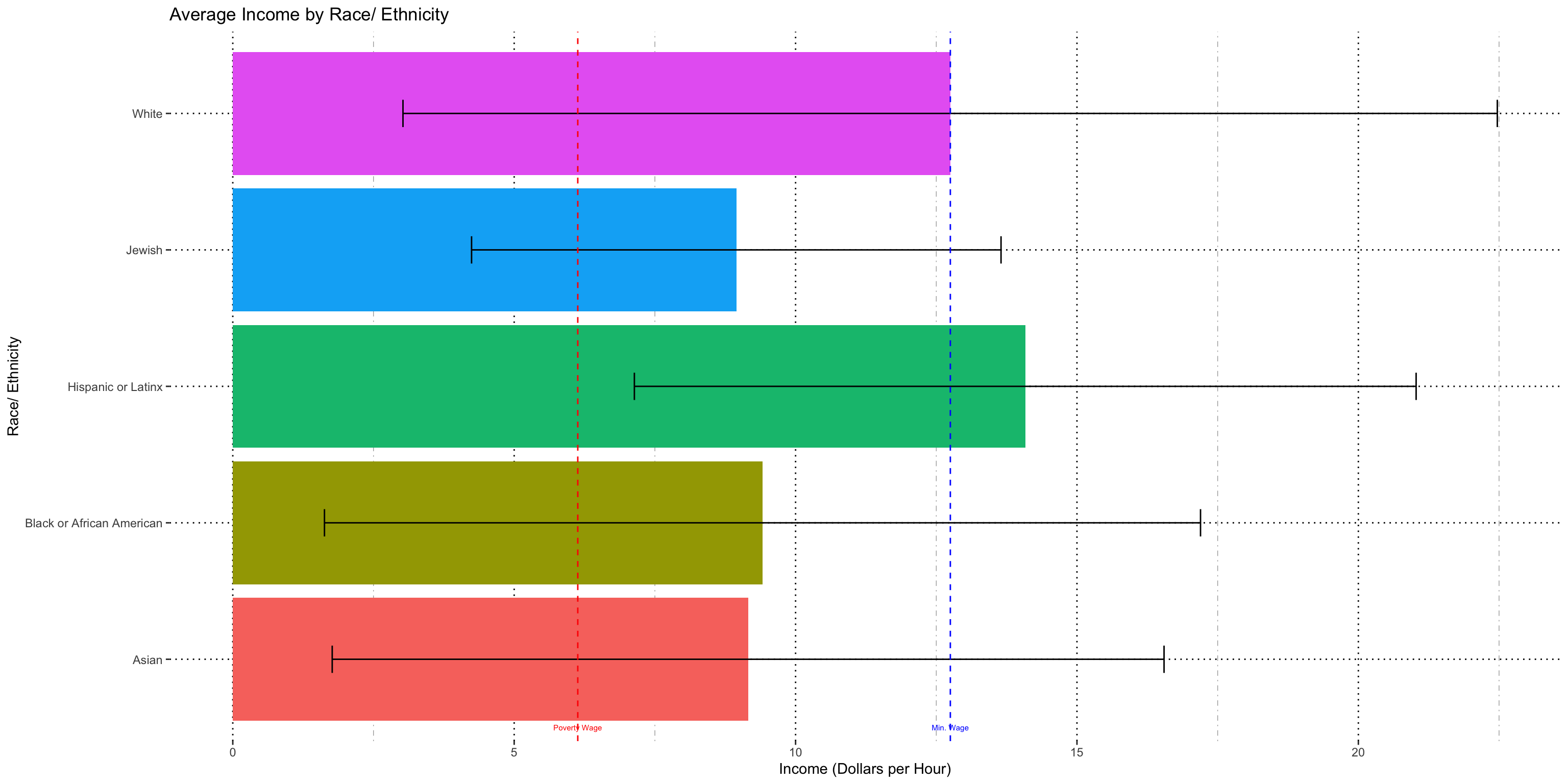
This chart doesn't tell us much except that there is high variability within the data. Note that the bars represent 1 standard deviaiton, so the range of the bar is my ~68% confidence range of the income for each racial category. This is true for all subsequent charts.
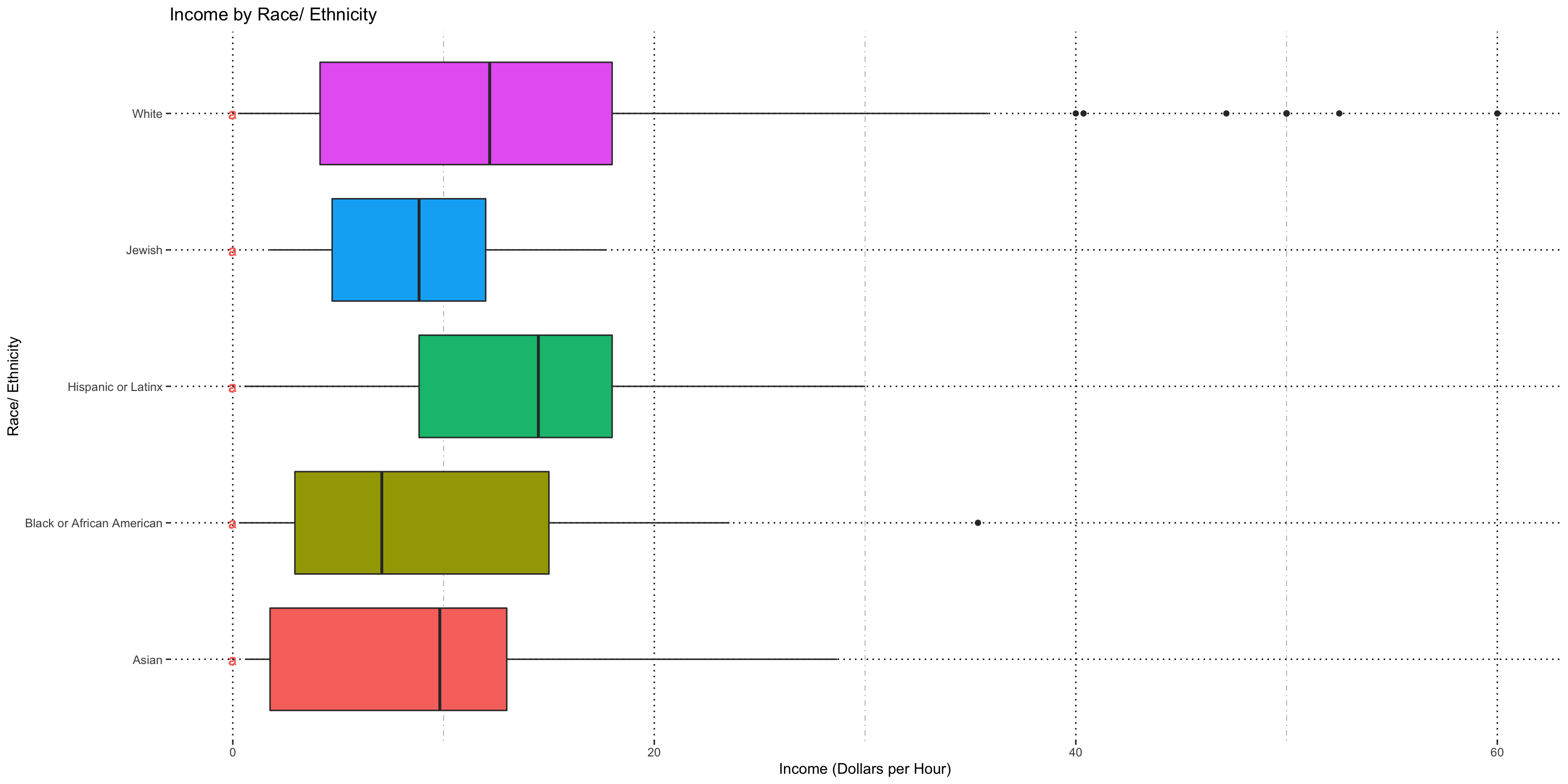
This chart shows us two things-- that the variability assumption is (probably) not violated when we are comparing the income by race, but also that there is no significant difference in income by race found in our data. The letters on the left hand side of the chart represent groups-- demographics that share a letter are statistically equivalent, and if they share no letters then they are significantly distinct.
Gender
I did find a significant interaction term, so cannot compare full set. Will split for tests.
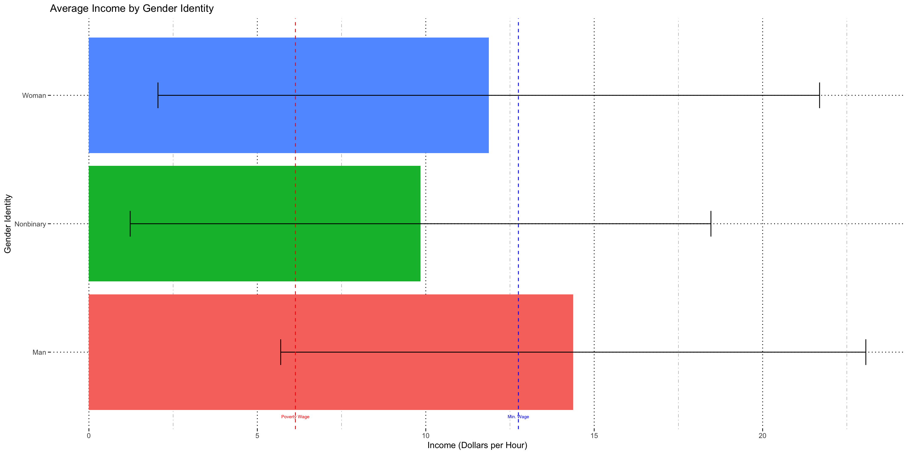
Variability in the data remains very high.
.png)
This is my sole significant result of this analysis, confirming that, on average, men are paid more women and non-binary people when I look at people who were paid any way except weekly.
.png)
When I look at people paid weekly I find no significant difference between groups.
For both of these tests I can say that my assumptions hold and the tests are valid.
Sexuality
I found significant interaction with every reported income scale so the data had to be split four ways for analysis.
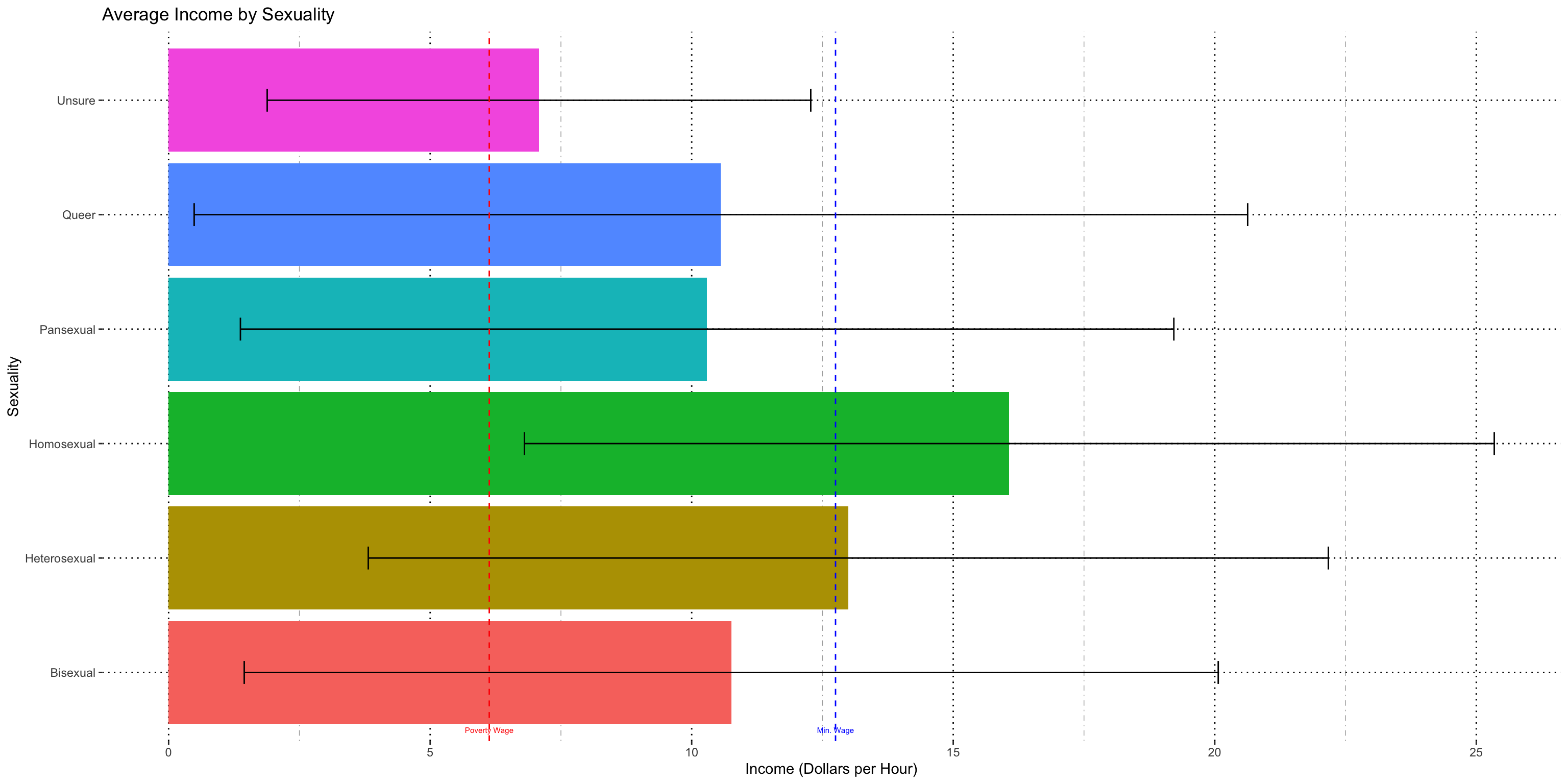
With sexuality and every other demographic split available in the data, the number of potentially valid groups is quite high. However, the between group variance is also quite high, and it makes parametric tests very fraught.
.png)
There's not enough people who reported annual income to make meaningful comparisons. This tells us absolutely nothing.
.png)
The variance is not close enough between groups for this test to be valid.
.png)
The variance is not close enough between groups for this test to be valid.
.png)
The variance is not close enough between groups for this test to be valid.
Since other demographics have even more possible categories, I elected to present these results and argue that the data collection needed to be improved for any significant results to be gleaned.
Conclusions
Even though everyone was free to report their pay on whatever scale they chose, the chosen scale is significantly predictive of pay amount even when normalized.
The only significant conclusion I can make is that men are paid more than women and non-binary people on average, otherwise either I couldn't use the test because the data violates assumptions or the results were simply not significant.
Some demographic subsets have very small variability and some have very large variability, so there may be some co-dependency or other variables that need to be controlled for. Industry expert suggest may be job title, but we don't have enough data to control for every distinct job title submitted. Further analysis on this income data will need a fundamentally different approach.
I recommended to StageSource that data collection needed to be improved (one standard method of reporting income) and we would need to limit the scope of analysis since there are so few data points for underrepresented minorities. They initially wanted me to be able to compare different average incomes, but that is simply not possible in this data.